Histogram in Excel
A histogram, also known as a column chart, is a graphical representation of the frequency distribution of data grouped into classes from a continuous probability distribution. This chart displays columns with areas proportional to the (relative) frequencies above the classes. A histogram provides a visualization of the probability density from which the data originates. (source: wikipedia) Generating a histogram in Excel is a highly convenient task that provides immediate insight into the desired data. To create a histogram in Excel, some background information is required. Additionally, adding an ‘add-in’ is necessary before you can make a histogram in Excel. Interested in learning how this works? Then read on.
Adding an Add-In to Create a Histogram in Excel:
To create a histogram in Excel, you first need to activate the Analysis ToolPak. This is not a complicated process, but it’s essential before you can start working with histograms in Excel. Let’s break it down into steps.
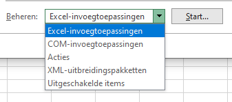
- Open an Excel workbook and click on File -> Options. You’ll see the following menu:
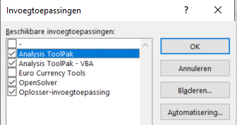
- Click on Add-Ins.
- Under “Manage,” select “Excel Add-ins,” then click “Go.”
- Check the box next to “Analysis ToolPak” and click OK.
Now we can proceed to create a Histogram Function.
How to Create a Histogram in Excel:
With the Analysis ToolPak activated, let’s use an example to demonstrate how to create a histogram in Excel. For this example, we’ll use the ages of 25 random individuals.
- Define the ‘BINS’. Step 1 is to specify the age categories for which you want to measure frequencies. In this example, we’ll use the BINS as shown in the screenshot. This means the 1st bin will contain ages 1-20, the 2nd bin 21-30, and so on. Excel automatically creates a bin for ages above 70.
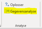
- Go to Data -> Data Analysis. Note that this option is available only if the Analysis ToolPak is activated. Choose Histogram.
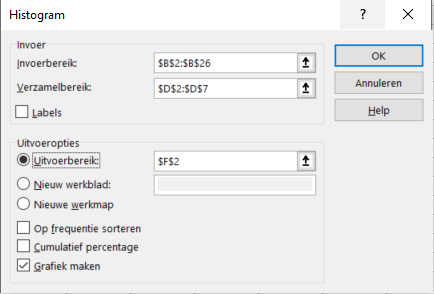
- The Histogram menu will appear, as shown below:
- Fill in the relevant data ranges in the menu. Input Range should contain the data you want to summarize. In this case, the ages of individuals. Bin Range is the BINS, the age categories in which you want to summarize the data. Output Range is the cell where you want to display the histogram summary. Check “Chart Output” to create a histogram chart. Click OK.
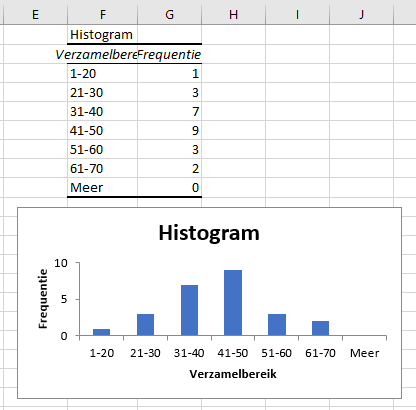
- The histogram will look something like this: In this example, we adjusted the bin ranges in cells F3:F8 To show how the bins relate to each other.
Need an Excel Specialist?
Do you require an Excel specialist for your current tasks? It’s best to get in touch with Bouwmeester Consultancy. We specialize in all things related to Microsoft Excel and are here to assist you. Feel free to contact us to discuss the possibilities. We’re here to help!


